This year marks the 4th edition of the “TCD AWARD,” a competition for the best websites built using the TCD theme. Each year, we see the quality of the winning sites improving.
Judging Criteria
・Creativity and Originality
・Rich and Engaging Content
・Aesthetic Design
・Looks Great on All Devices
We place special emphasis on the quality and depth of content during evaluations. While design, color schemes, and image quality are important, the website is merely a platform—the most crucial element is the content itself.
Award Winners
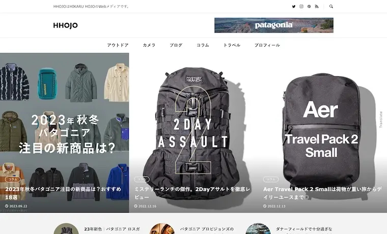
HHOJO
This year’s top spot goes to the web media site “HHOJO,” which makes excellent use of RUMBLE. Run by web designer Hikaru Hojo, the site stands out for its high-quality featured images, content, and overall balance, all of which reflect a strong sense of professionalism.
The carefully created featured images, combined with a simple color scheme, perfectly reflect RUMBLE’s concept. Both the quality and quantity of the content are outstanding, making it a model example of well-executed media.
I am impressed by the clean, stylish layout of the top page that makes the most of RUMBLE’s strengths, along with the wealth of information in each article.
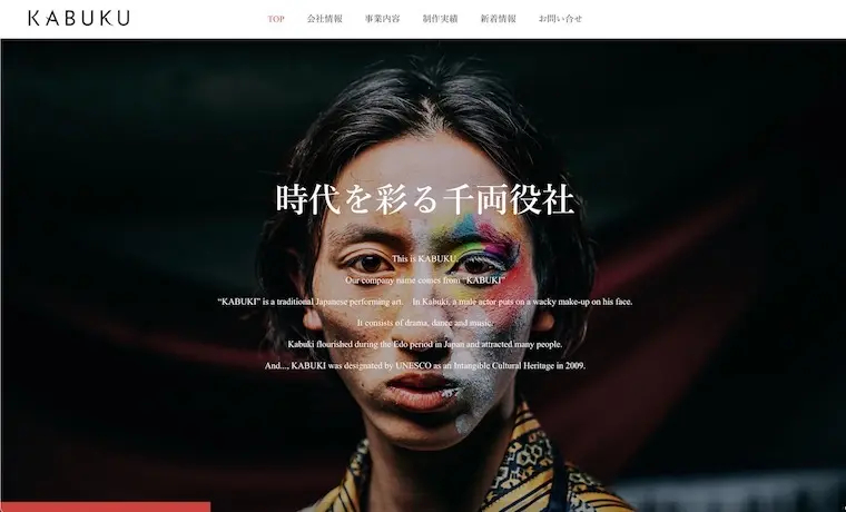
KABUKU
Second place goes to Kabuku Inc.’s website, where bold horizontal scrolling and striking photos make a strong impression. Eye-catching taglines and elements like the logo’s origin, company vision, and the CEO’s message skillfully reflect the company’s unique style and philosophy.
The design is consistent from the top to the sub pages, fully utilizing the HORIZON theme. The impactful photos and videos leave a lasting impression, which I really appreciated.
This site immediately caught my eye. The artistic images, combined with HORIZON’s sleek horizontal scrolling design, create a stylish and sophisticated look. It’s a site that truly stands out.

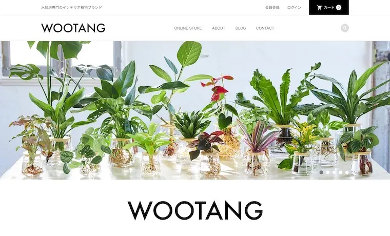
WOOTANG
3rd place goes to the EC site for WOOTANG, a brand specializing in hydroponic interior plants. From the above the fold, the site feels clean and fresh. It effectively highlights the benefits of hydroponics, such as the absence of soil and bugs. The monochrome color scheme and delicate fonts beautifully enhance the product images.
The site perfectly aligns with the theme’s design, showcasing the simple yet charming products. The use of white space and color is exquisite, making the products and materials feel vibrant.
The images are stunning, and the selection is excellent. The overall design maximizes the theme’s potential. The black primary color makes the green of the plants stand out.
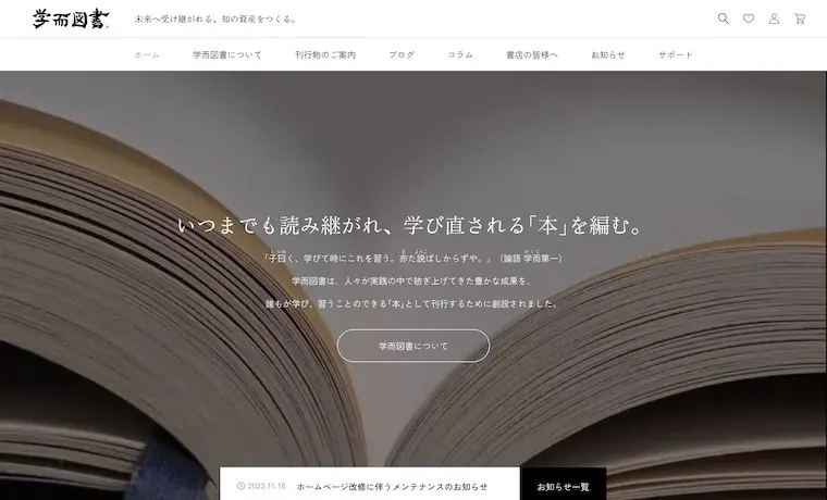
Gakuji Tosho
This EC site specializes in books, offering detailed product descriptions and easy browsing. Books teach us new things and connect us with voices from the past, making those read for generations feel especially romantic.
You can sense the attention to detail, even in the choice of fonts and other subtle elements. This care integrates seamlessly with the theme’s design, creating a well-balanced and cohesive look.
OKIBRA
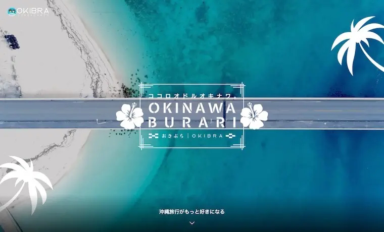
This site introducing travel to Okinawa features a beautifully crafted above the fold. The designers have skillfully integrated images of palm trees, hibiscus flowers, and other elements with the features of the “meets” theme.
The sophisticated design and smart use of layered images captivate visitors. This site effectively utilizes the theme’s features to create a charming atmosphere that will make anyone fall in love with Okinawa.
&FLOW
This web media shares stories of people active in various sports and outdoor activities. With frequent content updates, it consistently attracts a wide range of readers. As a passionate music lover, I especially enjoy the feature pages.
this site perfectly embodies a “highly designed web magazine,” making full use of CODE’s features and showcasing featured images for each article.
Tonarino PR Department
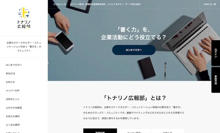
“Tonarino PR Department” is a private community of writers leveraging their skills for business. They make great use of SHIPS‘ membership features, with well-organized subpages and a site designed to address user concerns in advance.
This site is a great example of a content-rich membership site. The images are visually consistent, and the ‘For First-Time Visitors‘ page is easy to navigate.
INOUE & TSUKIOKA FOUNDATION
This site is full of character. From the top page, you can really feel the atmosphere of classic cinema. It’s an excellent reference for anyone looking to create a retro style.
The site is beautifully customized using the ANTHEM theme. The attention to detail is evident not only in the video on the above the fold but also in the images and fonts.
Theme:ANTHEM(TCD083)
MONTEPLATA
The brand site for outdoor gear brand “MONTEPLATA” showcases high-quality photos, emphasizing the importance of top-tier images in enhancing brand appeal.
A dynamic page instantly immerses you in the brand’s world and atmosphere. The theme’s design aligns perfectly, offering a refined entry point for the brand.
Theme:VOGUE(TCD051)
STUDIO myy
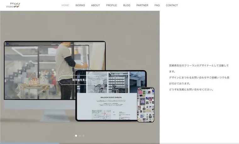
This is the portfolio site of a freelance designer. He has skillfully employed a unique horizontal scrolling design, and the color palette is absolutely stunning.
The WORKS page effectively showcases the theme’s features. It beautifully presents a variety of creative works while remaining true to the HORIZON design.
Theme:HORIZON(TCD093)
Special Award
This time, it took longer to determine the rankings. The high quality of all the sites made it tough to choose. Since results were often decided by just one vote, I would like to highlight them with this special award.
TCD AWARD 2024
For the 2024 TCD AWARD, we selected websites that not only make a strong visual impact at first glance but also offer an exceptional user experience.
TCD AWARD 2023
As high-quality websites continue to rise, differentiating between them becomes increasingly difficult each year. In 2023, we focused on the importance of content and carefully selected our examples.
TCD AWARD 2022
We’ve gathered a collection of impressive websites that are truly inspiring. The images used are of high quality, and the color schemes are beautiful.
TCD AWARD 2021
Regardless of their fame or obscurity, we selected sites based on their overall quality and the passion of their creators. The collection features some truly captivating works.

